Choosing the right font for your website can sometimes be considered a complicated matter. Given the number of fonts available and the various factors to consider, it can resemble rocket science. However, it’s important to choose the right fonts because they can affect the overall impression and readability of your website.
There are several ways
Perhaps the most important thing for the client is to find out that there are paid fonts and free fonts.
Free fonts are available absolutely freely for anyone and for any purpose (mostly). Paid fonts are purchased with a license and can be e.g. use only on a specific platform (e.g. not every font you use on the web can also be used for printed materials, etc.).
Font types and properties
Individual fonts differ from each other in appearance and characteristics. One character (letter) of a given font is simplistically referred to as a glyph.
- Serif: so called. footer fonts. Especially suitable for reading long texts, they are mostly used for printed materials (newspapers, books…). The most famous footer font from the days of MS Word is “Times New Roman”.
- Sans-serif: Footless fonts. Don’t include those “quacks” within individual letters. They are mainly used for display on screens. These are the fonts you will use when creating your website. Frequently used fonts are e.g. Roboto, Open Sans (this text is also written with it).
- Display: fonts that are out of the norm, characterized by some form of extravagance.
- Monospace: it is specific to these fonts that each letter is the same width, unlike the others where it varies. They are mainly used when writing codes, in consoles, etc. I’m sure you remember the font “Courier New” from MS Word.
- Handwrite: fonts that try to imitate handwritten writing.
Each font has several properties. The most important are the cuts of the font (thickness) and the language.
Font cuts are actually font thicknesses. From Word, you’ll be familiar with the B icon, which makes the font bold. In fact, there are up to 9 such cuts, but on the other hand, not every font has every cut available.
- 100 (ultra light): thinnest font
- 200 (extra light): second thinnest font
- 300 (light): font thinner than normal
- 400 (regular): normal font thickness
- 500 (medium): slightly coarser than regular
- 600 (semi-bold)
- 700 (bold): classic bold
- 800 (extra-bold): even thicker than thick
- 900 (black): the thickest font
A font language is something different from the standard language we are familiar with. It is actually a family of languages that you may remember from Slovak in primary school. So LATIN will be an interesting language for our area. We use Latin. Other languages are e.g. CYRILIC e.g. for Russia, Ukraine (Cyrillic), or ARABIC (Arabic script), JAPANESE (Japanese characters), etc.
Another important aspect is the so-called. subset. Ours is called “Latin-extended”. This is an extension of the classical Latin alphabet to include our long and soft tenses. Thus, the classical Latin alphabet contains only basic characters and instead of lengths and soft characters, a character from a substitute font from the browser’s predefined font family is printed. This then results in graphic waste, such as. This:

We can see that characters with accents are displayed differently than others. This is because the font used , Julius Sans One, does not support diacritics, so the browser has replaced these letters with the default font. Never do this. Please.
How to use fonts in Google Fonts?
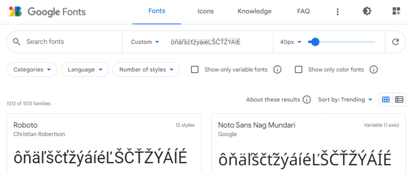
The most convenient way to select fonts is on Google Fonts (hereafter I’ll use the abbreviation “gfonts”). It’s actually one of Google’s services where all their fonts are collected, available for free. Elementor also natively includes gfonts, so you can choose from them. In practice, I often do this when creating web pages by finding a font on gfonts and then looking it up in Elementor and applying it. But even if you don’t use Elementor, it doesn’t matter, the vast majority of themes and builders use gfonts. These are the fonts that are used on most websites, regardless of whether they are created via WordPress or otherwise.
When we arrive at the gfonts website, we have a filter available right at the top, where we can select the category (that’s the 5 listed above), the language, the number of styles (there are up to 18 of them).
Above that, we can search for a font by name, or type our own text in the “Type something” box, which is immediately applied to the preview of the fonts shown below. On the far right we can still select the thumbnail size.
So, how do you make finding the right font for your website easier? Since we need all the lengths and softnesses, we write them down in the “Type something” field. And we can immediately see which font we can and cannot use. To avoid having to scroll through a “million” fonts, we can narrow down the choice by selecting the correct font category (“Categories”) and language (“Language”) – for Slovak/Czech sites we select “latin extended”.
Other resources
Finally, I offer a few more font databases. Some are free, some are paid and some are even-aj
If you still don’t get enough, just google “fonts” and search and search. But as I mentioned above, Google Fonts is the most commonly used for the web, it’s more or less an unwritten standard.