Pop-ups, in other words pop-up windows, are a common part of websites today. Its task is to alert the user to some important event, to direct his attention in the direction we want. In more professional circles we can also meet the name “modal”. Inaccurately, some users also refer to these pop-ups as “lightboxes”. In reality, however, lightbox is a javascript library for displaying image galleries that opens in a popup window, not the popup itself.
Pop-ups in WordPresse
By default, it is not possible to make a pop-up in WordPress. However, there are a quantum of plugins that can provide it for us. The best known are probably Popup Maker, Popup Builder and Popup anything.
Better themes and almost all builders have the ability to create pop-ups directly within themselves. Elementor Pro also hides the possibility to create high quality pop-ups. Its settings and possibilities are incredibly wide. So let’s show you how to do it.
Creating a pop-up in Elementor
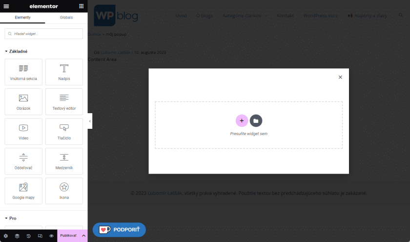
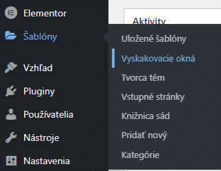 In the left column in the administration we can find the “Templates” item, which is always located under “Elementor”. The second item in the submenu is “Popups”. Click there to get to the list of created pop-ups, which will now probably be empty. Use the button on the top left (or below the text) to add the first pop-up.
From Elementor’s point of view, a pop-up is actually just another template that has a specific display setting, but we’ll get to that.
When we click on the button, a table will pop up where we enter the name. It is important that the Template Type is selected as “Popup”. Click on the “Create Template” button to get to Elementor.
Note: If you are using the new Theme Builder, Elementor will load as soon as you click the “Add” button. You don’t write the name, it is generated automatically, so then you have to edit the name directly in Elementor.
Working with pop-ups is pretty much the same as with other Elementor pages, templates, or articles, the difference is that Elementor shows you an already “popped up” window where we create content:
The main pop-up settings are made by clicking on the cogwheel on the bottom left. We have settings, style and advanced. On the outside, these pop-up settings look as if they are a simple element (e.g. a block of text). This is where we can set up the basic aspects of the pop-up.
Settings tab: In the layout, we set the basic properties of the pop-up. Width, height, position are probably clear. An overlay is a coloured “darkening” of the background. Close button will show or hide the cross, which the user will use to close the pop-up. The input and output animation can make the arrival and departure of the window interesting (e.g. it flies in from below).
In general settings we practically deal only with the name of the pop-up, which we set so that we know what the pop-up shows (in practice, then there may be 10 pop-ups and 10 templates on the page and if each is called Elementor-item-#1234, you will not know it). If you are using the old Theme Builder view, the title will already be there, filled in according to what you entered when you created the pop-up template.
In the Preview settings we can classically set an article if we need it because of dynamic data.
Style card: Background settings, corner rounding, shadow and similar settings are familiar to us from Elementor.
In the Overlay we set the colour of the colour overlay or even the image. If we have disabled Overlay, this setting will not be there.
In Close button we set the button to close the pop-up.
That would be about it from this section. Click on the 9 dots on the top left to show the list of elements and just create as in the classic Elementor when creating pages.
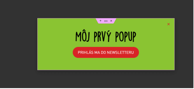
We can use all available elements for this. Do you need to insert a form for a newsletter, announce a holiday in the e-shop, forward a user to some promotional product? Not a problem. It’s up to you. Buttons, forms, counters, images, video, anything can be used.
We also work with responsive mode and navigator (if needed) as usual. Once we have our pop-up ready, it’s time to publish it.
Publication pop-up
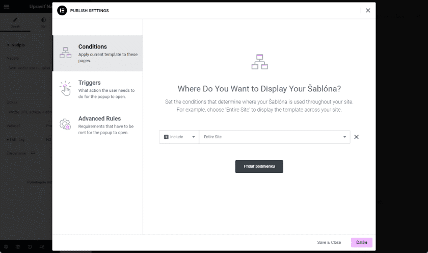
Conditions
However, after clicking on the “Publish” button, a strange table pops up: display conditions. And it is in these conditions that the great power of Elementor’s pop-ups lies. If you have already made templates e.g. for Single, post archive, product, etc. you will be familiar with at least the first tab, where we set the conditions for Include and Exclude. We can choose typical pages, page types, articles, include pop-ups in only one page, categories, tags and so on. The classic will probably be “Entire page”, i.e. the pop-up will be displayed on the entire page, even if someone comes to it from another source and does not come to the home page but to any subpage.
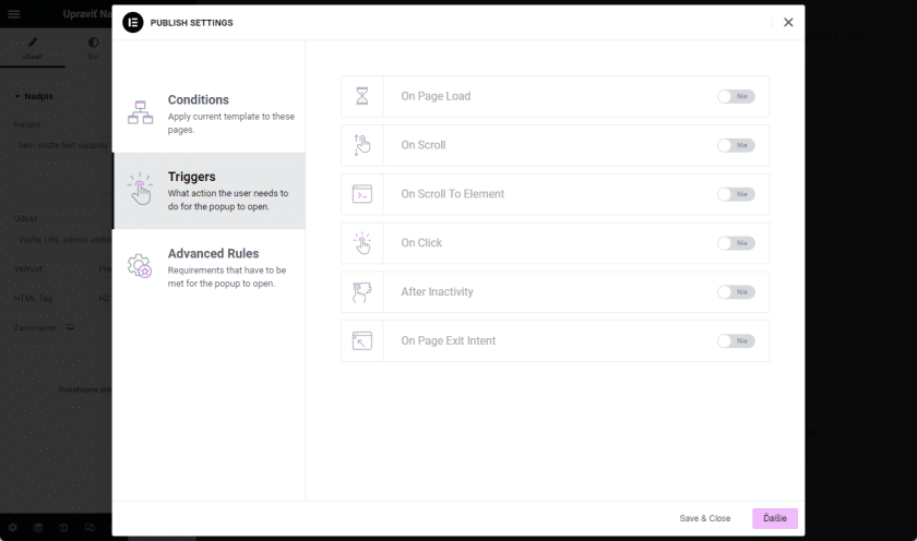
Triggers
In the Triggers tab, we set when and under what circumstances the pop-up should be triggered.
On Page Load: when the page is loaded. By activating the filter we can still set the delay in seconds.
On Scroll: when scrolling with the mouse. We can set whether the scroll is down or up, and what percentage of the monitor the user has to scroll in order for the pop-up to trigger.
On Scroll To Element: we can set an element that when the user scrolls to, a pop-up will be triggered. We set the element using the css class we specified.
On Click: the pop-up is triggered by a mouse click. We can even set a bounce, e.g. 4 means that only on the user’s fourth click on the page will the pop-up be triggered.
After inactivity: pop-up will be triggered even when the user is inactive (not scrolling, not clicking). Set the time in seconds when this should happen.
On Page Exit Intent: a pop-up is triggered when the user attempts to exit the page. Most often, when the mouse goes to the top right of the monitor, where the browser window or tab where the web is on closes. Javascript can detect this and trigger a pop-up.
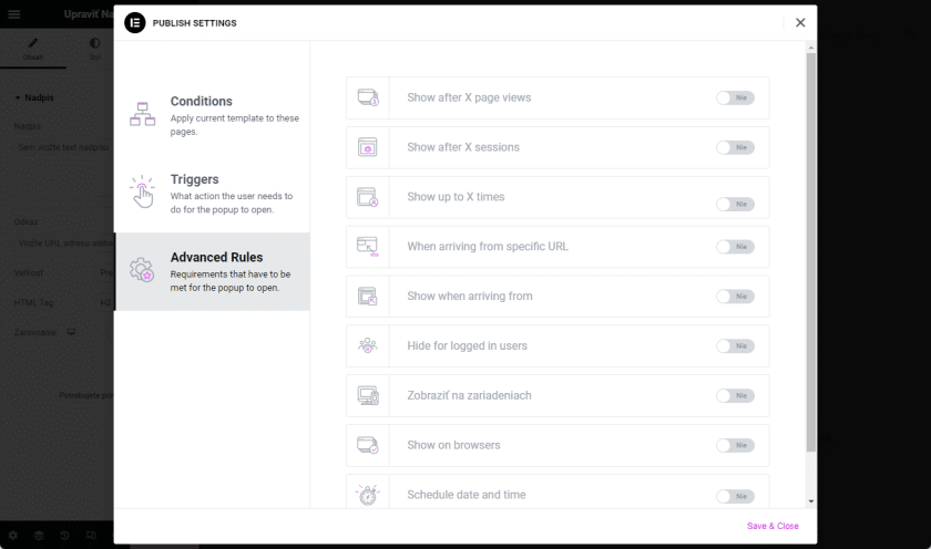
Advanced Rules
The Advanced Rules tab allows us to further customize the triggering and behavior of pop-ups.
Show after X page views: set that the pop-up should not be displayed immediately, but only after X page views. For example, when refreshing or clicking on subpages. If there are 3, the user has to get to the third subpage (or refresh the site 3 times) for the pop-up to pop up.
Show after X sessions: Something similar to the above, a session is considered to be the time from the user’s arrival on the site to their departure (and a few minutes after that, depending on the server). Unlike page views, sessions are stored in cookies, so the site remembers when a user comes to the site even a week later and sees a pop-up.
Show up to X times: a very important setting that prevents the same pop-up from appearing over and over again. Set to 1 so that the user sees the pop-up only once. Then we set the time unit (session, day, week, month), so that the pop-up will be displayed again after the set time has elapsed. And finally, we set the count – whether the pop-up is considered to be displayed when it pops up(on open) or only when the user closes it(on close).
When arriving from specific URL: when a user arrives from a specific URL, we may show them a pop-up. We can set whether the pop-up should be displayed, hidden or we can set its behaviour via “Regex” (regular expressions), but this requires a bit more programming skills.
Show when arriving from: Set to display when the user is arriving from
- Search Engines: i.e. from search engines like google, yandex, bing, list
- External links: from an external source, i.e. from another site that links to yours
- Internal links: from own site
Hide for logged in users: hide pop-up for logged in users. Very suitable if, for example. the pop-up encourages you to register on your website. In this case, displaying this pop-up would be annoying for already registered and logged-in users. In the case of Custom, we can specify special roles of users to whom the pop-up should not be displayed. Suitable for use in any membership systems.
View on devices: classic. I choose whether to display the pop-up everywhere or only on one or two of my desktop, tablet and mobile.
Show on browsers: we can even show the pop-up only to users who see the site on one or more of the five major browsers (Internet Explorer, Chrome, Edge, Firefox and Safari)
Schedule date and time: Finally, we can schedule the pop-up to display on a specific “from-to” date and time. We set the time zone, whether the pop-up should follow the time zone of the page or the user (e.g. a user from Japan has a different time and date than the Slovak website).
Manually launch a pop-up
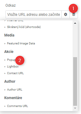 If we don’t fill in any of the above items and just publish, the pop-up will never appear, but will exist. Such a pop-up can then be triggered by a link, i.e. in any element that has a link (title, image, icon, icon box, etc.). In the link, we then select Dynamic Fields -> Popup. Click on it again and type the name of the pop-up. We can then also set whether clicking on the element should open or close the pop-up, or whether the element should “toggle” it (i.e. open and close).
Use in practice
As we noted above, pop-ups are a frequently occurring element on many websites today. Their job is to focus the user’s attention on what we want. In practice, pop-ups are most commonly used as
- Quick and important notifications (holiday announcements, closures, etc.)
- Distribution of discounts and discount codes, occasional and seasonal promotions (e.g. summer sale, Black Friday, etc.)
- Collecting email addresses for the purpose of a newsletter (the pop-up may also include a form)
- Any graphic motives, e.g. opening a contact form in a pop-up instead of a classic subpage, or creating team members in a pop-up
- Keeping the user on the page where we want them to be and still offer them different content (e.g. in the checkout of an e-shop, we want the customer to stay there and not change their mind about the purchase, so we open the terms and conditions they click on in a pop-up instead of taking them away from the checkout page to the T&Cs sub-page)